With Storyline 2, I was having issues with complex behaviours in HTML5 (e.g. having custom controls, attaching custom variables and passing them to an LMS, and differences between development and published environments).
Here is some my background, I’m a Macbook Pro user using High Sierra running VMWare Fusion. I come from a design background with web and mobile development experience.
I wanted to test to see what the differences were between Storyline 2 and 3. Most of our customers are large organizations and we wanted to test drive Storyline 3 before making a recommendation.
Overall Storyline 3 comes as an improvement to its predecessor Storyline 2.
A trial version of Storyline 3 can be downloaded here:
https://articulate.com/p/trial?product=storyline-3
Some of the main differences between Storyline 2 and 3 are as follows:
New Responsive Player
Storyline 3 has a new responsive player that adjusts the course content to various devices such as smartphones and tablets without any additional programming.
Custom Closed Captions
Storyline 3 supports customizing closed captioning while helping you create more accessible eLearning. It supports all the standard caption files. You can import, export, show and hide the captions at your convenience. You can even use the custom fonts for closed captions.
Superior HTML5 Output
Articulate has put a lot of effort to fine tune the HTML5 output so that your eLearning courses work smoothly on any device. Articulate claims that no matter how custom or complex your eLearning course design gets, it’s going to run on any device or browser. Elearning developers can now choose a format they desire and create responsive HTML5-based eLearning content. All you have to do is simply drag the ‘Publish As’ slider and choose the desired publishing options.
Better Starting Templates
Articulate has some smart looking templates which cover the core features an elearning developer needs.
Our tests upgrading a project from Storyline 2 to 3
I took one of the courses we had previously developed which I had had to customize to get it to work properly. With Storyline 2, I had to write a fair amount of custom javascript and other workarounds with states and variables in order to get everything to work.
I did a full publish in Storyline 3 and below are my comments:
-
The Storyline 3 player forces older storyline projects to be upgraded. It creates a backup of the older project so no need to worry about losing it.
-
Publish speeds seem about the same.
-
The user interface of the product seems a little faster and more polished.
-
There are different loader screens after publishing – gone is the spinner, now it’s just 3 dots.
-
The HTML5 version seems a little faster in terms of load time.
-
Some of the javascript, tweaks of states etc. I had made previously in Storyline 2 don’t seem to work correctly in Storyline 3.
-
I installed the mobile Articulate Player app. It didn’t seem to work. All I got was a blank screen. I could not bring up menus. (Hmmm not a strong recommendation for mobile only use).
-
I uninstalled the Articulate Player app on my phone and tried again.
-
I viewed the course on an Android Pixel 2 phone which took me to the Google Play store but I got a blank screen.
- The video player seems to work better in HTML. I’m able to skip to certain sections.
- The embed code works for videos in HTML5 and Flash (though no one uses it anymore).
- Good testing for playback on various devices e.g. desktop and mobile.
- States and Javascripts seem more accurate. When I compare the amount of code I had to add in order for Storyline 2 to work versus 3. It has been reduced greatly.
- Screen recordings have been greatly improved. Screen elements before were shifting and moving for HTML5. They have all been fixed. Looks solid.
Link to Latest Version of Articulate Mobile Player
https://play.google.com/store/apps/details?id=air.com.articulate.articulatemobileplayer
Samples of Glitchy Screens when Upgraded Project from Storyline 2 to Storyline 3
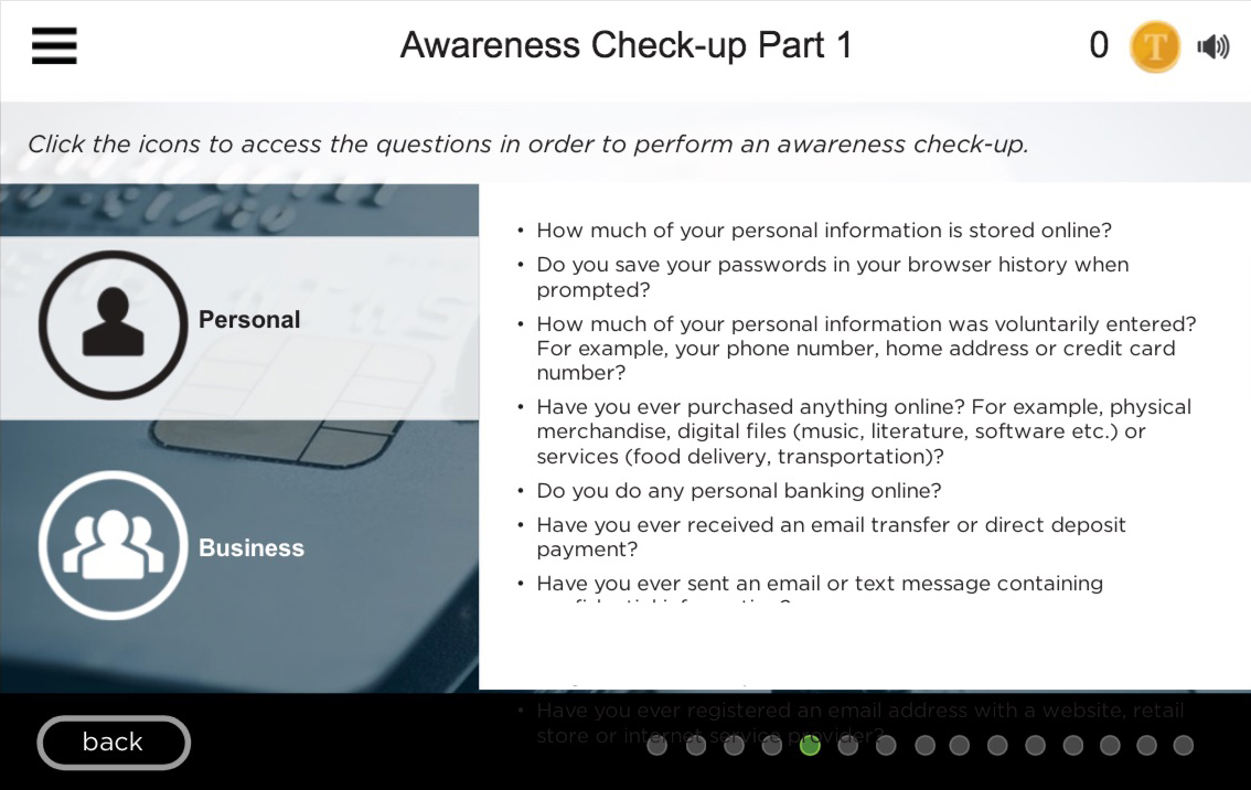
Image 1: Image of hand is repeated and multiple selections on screen are highlighted simultaneously.

Image 2: Masking seems to cut off the text slightly (see final bullet on page, text is cut off).

Conclusion
Choosing the right elearning authoring tool for responsive mobile learning is a bit overwhelming. Storyline 3 is a simple and intuitive authoring tool with a short learning curve. Though Storyline 3 addresses the concerns of multi-device eLearning, it is not very effective for developing fully responsive eLearning courses. The responsive player shrinks the content to the screen size of the device instead of adapting the layout. Articulate hasn’t made an attempt to address this issue in Storyline 3. Overall, it fixes many of the Storyline 2 problem in terms of HTML5, though I wouldn’t recommend upgrading existing projects from 2 to 3. I would recommend however recommend choosing Storyline 3 over Storyline 2. You’ll save lots of time in testing and coding.

