My thoughts using Sketch
First some background information on myself.
I’m a big adobe creative suite user. I use the adobe suite for all aspects of creating designs for user interface, web, illustrations and print. I was finding that for rapid UI creation and creating screens for projects, illustrator was getting a little bloated. Illustrator is great for general creation but, with specific UI creation (rapid screen design) it’s a little slow. I did a couple of small projects for comparison purposes.
My Approach
My workflow for UI design is typically as follows: Requirements Documents, Balsmaiq, Illustrator and Silverlight (for high fidelity interactive prototypes). Using Sketch I found it simplified the process of by combing aspects of my workflow and being more of a lightweight product. The process for Sketch would be requirements docs, sketch and InVision.
Sketch is the ultimate tool for iOS, Android and Web design. It barely weights 41MB in disk space, compared to Illustrator’s 1.6GB. As soon as you open it, you are greeted with an infinite canvas. No window will ask you about what units to use or what size your canvas should be. Just like native OS X apps, you have a familiar user interface with a Toolbar, Navigator and Inspector. As a result, new users will find Sketch far more approachable because it doesn’t get in the way of producing simple designs.
Designing for Screens
You’re not overwhelmed by a Toolbar where half of the options were intended for photo editing, digital painting and 3D all screens are in pixels only.
There’s nothing wrong with them, but focusing on just user interface design will allow you to be more efficient and less distracted.
UI Templates
Sketch comes preloaded with a number of user interface templates for iOS, Material Design and Responsive Web. To access them for example you simply have to go File >New From Template > iOS UI Design.
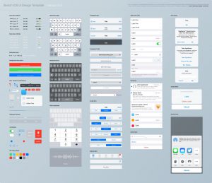
A great place to download a unique templates for a specific requirements is:
https://www.sketchappsources.com/
Working With Text
If you’re new to typography, I suggest heading to the Typography section and start downloading a few modern fonts. The good ones that comes with OS X or free on Google Fonts are San Francisco, Avenir Next, Open Sans and Roboto. If you have a subscription to Typekit, download Museo and Proxima Nova.
Working With Icons
Last but not least, you’ll need in your arsenal a nice library of vector icons. The ones by PixelLove and Streamline will work well for iOS. Sketch is entirely vector-based so you can easily import SVG icons (a universal vector format), and edit them as you see fit. If you’re uncomfortable working with vector paths, you can at least change the color and size to fit your project. To get an introduction to vectors in Sketch, I suggest heading to the section
Working with Pages
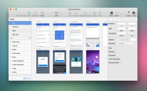
Each Page represents a platform or a completely different resolution. For most projects, you’ll have twenty something Artboards for a platform like iOS. Then, you’d create another Page for Android, Web, Apple Watch, tvOS, etc. That way, you can have an entire project within a single Sketch file, saving you a ton of time switching between screens and platforms.
Working Symbols
I found this to be very powerful if not the most powerful feature. When I downloaded a bootstrap template it had all the buttons and states already in a library, before I would have to recreate this and now they are already available. This reminds me of coding the same feature is HTML CSS e.g. calling a particular class. Symbols work much the same way, I could call in the design with the appropriate state already based on the design requirement. Symbols makes it easy to share the same elements across multiple Artboards. This is especially useful when you re-use the same elements multiple times like for Status Bar, Navigation bar or Tab Bar. You won’t need to go back and edit those elements one by one. As you update one, it’ll synchronize to all the other ones that share the same Symbol.
Quick Export to Multiple Resolutions
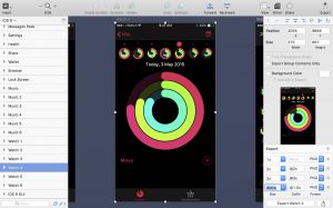
Perhaps my favorite new feature is the ability to easily export at multiple screen resolutions. By using Make Exportable in the bottom right of the screen, you can export at any scale (1x, 2x, 3x) and 6 file formats (JPG, PNG, SVG, PDF, TIFF and EPS). PDF in particular is useful for iOS assets, and SVG is a fantastic format for the Web. For many users, this is what makes Sketch shine from the other apps.
Click Make Exportable to set up your slices. By default, it’ll set the scale at 1x, but click again and you’ll quickly get 2x, then 3x. You can also set the scale to a width (w) or height (h). For instance, if you wish your asset to export at maximum 800 px wide, set 800w.
Using Sketch and InVision
Sketch feels more like an open source product than illustrator. When combined with Invision a user can easily add interactive designs that come to life. Previously, a designer would have to design the screens before in illustrator than re-create them in another fashion like HTML, silverlight, PDFs etc to simulate some sort of interactivity. With Invision using the Craft plugin a designer can combine a couple of these steps and as a bonus can create interactive prototypes on a variety of platforms iOS, Android and iPad. The bonus of using InVision is the collaboration aspect, clients are able to draw on the prototype and individual screens which is much faster than sending emails back and fourth.
https://www.invisionapp.com/sketch-prototyping
https://www.invisionapp.com/craft


